

 Shop All Packaging
 Glass Containers
 Plastic Containers
 Metal Containers
 Cardboard Containers
 Bulk Containers
 Industrial Containers
 Caps / Closures
 Shrink Bands
 Design Custom Labels
 Subscribe & Save Orders
 Shop By Industry
 Custom Packaging
 Pallet Qty Packaging
 Packaging Equipment
 Help/Info
 New Products
 Promotions
 Newsletters
 Combo Kit Deals
 Product Closeouts
 Recently Back In Stock


Label Tutorial: How to Create the Apothecary Label
Remember to follow steps 1 - 3 on the
main tutorial page
to initially set up your label document. Then, go through the steps below to create the "Apothecary" label!
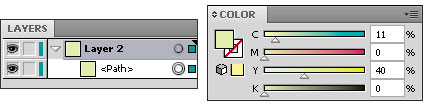
Step 1: Change the Background Color
Select the rectangle you drew in the previous step using the Selection or Direct Selection
tools, or click on the circle next to the path in the Layers palette. Enter the following values in the Color palette to change the color to a light green: C=11, M=0, Y=40, K=0.
Step 2: Draw the Ornamental Decoration
Use a combination of the Ellipse
, Pen
, Arc
and Spiral
tools to draw each of the shapes below.
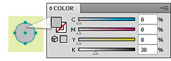
A. How to create apostrophe-shaped flourishes. These shapes have a bulbous end with a thin, tapered tail.
1. Choose a light gray color (30% black in the Color palette) and select the Ellipse tool. Hold down the Shift key as you click and drag the mouse to draw a perfect circle.
A. How to create apostrophe-shaped flourishes. These shapes have a bulbous end with a thin, tapered tail.
1. Choose a light gray color (30% black in the Color palette) and select the Ellipse tool. Hold down the Shift key as you click and drag the mouse to draw a perfect circle.
2.
Select the
Arc
tool
and hover the cursor over the top anchor of the circle. Click and drag the mouse to draw the arc. To change the slope of the curve, press the Up or Down arrow keys.
3. Draw a second arc beginning at the bottom of the circle, ending at the tip of the first arc. If you have Smart Guides turned on (Ctrl + U), these points should "snap" together.
4. Combine the paths into one object. First, lock the green path by clicking in the empty box next to its eyeball in the Layers palette (this will allow you to select objects in front of this path without altering the green path's appearance).
Using the Direct Selection tool, click and drag the cursor to make a dotted-line box only around the ends of the arcs to select the two points. In the main menu, select Object > Path > Join (Ctrl + J) and choose Corner.
In the Layers palette, click the circles to the right of the arc and circle paths while holding down the Shift key to select them. Click on the Unite icon in the Pathfinder palette (under Shape Modes) to join the two shapes into a single path. If the shape has a gray stroke and no fill, press Shift + X to swap them.
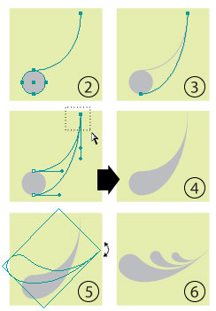
5.
Change the angle of the shape by selecting it with the Selection Tool
and hovering the mouse outside one of the corners of the bounding box until you see the rotate
symbol. Click and drag until you reach the desired angle. Or, you can select the path and click on
Object > Transform > Rotate
from the main menu and enter a specific angle.
6. You can also add several instances of the shape by copying & pasting it (Ctrl + C, Ctrl + V) and then resizing it by dragging the corners of the bounding box with the Selection tool or going to Object > Transform > Scale .
7. To get different effects, experiment with the placement of the arcs on the circles, use the Pen tool to change the slope of the lines, add circles to the design, etc.

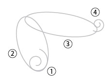
You can also select the tool and click in your document to bring up the Spiral dialogue box.
1.
Begin by creating a spiral with six segments.
2. Select the Ellipse tool and draw an oval around the spiral (width: 0.6 in, height: 1 in) and rotate it at a slight angle (17 ° ).
3. Draw another oval (width: 1.4 in, height: 0.5 in, -8.5 ° ) and move it with the Selection tool so it overlaps the first ellipse.
4. Select the first spiral and copy & paste it (Ctrl + C, Ctrl + V). From the main menu, click Object > Transform > Reflect and choose the Horizontal axis. Then click Object > Transform > Scale and reduce the Uniform Scale to 60%. Rotate the spiral -50 ° by choosing Object > Transform > Rotate. Finally, use the Selection tool to move the path so it slightly overlaps the top oval.
5.
Select the first oval then choose the Scissors
tool (under the Eraser) from the toolbar. Hover the cursor over the intersection of the first spiral's tail and the oval until the word "intersect" appears next to the crosshairs (make sure Smart Guides are turned on from the View menu). Click in this spot to "cut" the path into two parts. Use the Scissors tool again at the top-most intersection of the two ovals.

6.
Using the Direct Selection
tool, hold down the Alt key so the white arrow cursor has a "plus" sign
next to it. Click on the left side of the oval. Hit the Delete key to remove this section.
7. Select the top oval path and use the Scissors tool to cut it. First, where it meets the top part of the original oval and again where it intersects the tail of the smaller spiral. Follow step 6 to remove the top part of this oval.
Follow the same steps above to cut the "tails" off of both sprials.

8.
With the Direct Selection tool, click and drag the cursor to make a dotted-line box around the two points at the upper left, where the paths from the ovals meet. In the main menu, select
Object > Path > Join (Ctrl + J)
and choose Smooth. Repeat this step two more times at the points where this path meets each of the spirals. If any of the connections look jagged, use the Pen
tool to smooth them. Hold down the Alt key and hover the cursor over the affected point until it turns into a caret ( ? ) shape. Click on the point and drag so the handles are in the same line.

C. Combine the elements.
Once you have drawn several objects, use the Selection tool to move them together. Adjust the paths with the Pen or Direct Selection tools as needed.
1. When one side of the design has been completed, select all of the paths and group them together by going to Object > Group (Ctrl + G) in the main menu.
2. Next select Object > Transform > Reflect. Choose the Vertical axis and click Copy. Using the Selection tool, move the new group to the right to make a symetrical design.
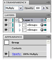
D. Add coloring effects. To give the design a muted appearance, the entire group's transparency is set to Multiply.
1. Select the design in the Layers palette by clicking on the circles to the right of each group.
2. In the Transparency palette, change the Blending Mode from "Normal" to "Multiply." The circles next to the groups in the Layers palette will now be shaded indicating that they have complex appearances applied.
3. Change the shades of gray to give the design more depth. For this example, the fill of the top-most flourishes and dots has been reduced to 20% black.
1. When one side of the design has been completed, select all of the paths and group them together by going to Object > Group (Ctrl + G) in the main menu.
2. Next select Object > Transform > Reflect. Choose the Vertical axis and click Copy. Using the Selection tool, move the new group to the right to make a symetrical design.
D. Add coloring effects. To give the design a muted appearance, the entire group's transparency is set to Multiply.
1. Select the design in the Layers palette by clicking on the circles to the right of each group.
2. In the Transparency palette, change the Blending Mode from "Normal" to "Multiply." The circles next to the groups in the Layers palette will now be shaded indicating that they have complex appearances applied.
3. Change the shades of gray to give the design more depth. For this example, the fill of the top-most flourishes and dots has been reduced to 20% black.
1.
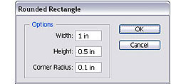
Select the Rounded Rectangle
tool, which is located under the Rectangle
tool. There are two ways to make your shape:
a. Click anywhere inside the artboard to bring up the Rounded Rectangle dialogue box. Enter width and height values as well as the Corner radius - a larger value here will result in more rounded corners.
b. Click and drag inside the artboard until you achieve the desired size. Before releasing the mouse button, you can change the corner radius using the up and down arrows on the keyboard.
2. In the Appearance palette, change the fill to white and the stroke to a medium gray (K - 50%). Move this layer below the shapes drawn in Step 2.
Step 3: Draw a Rounded Rectangle
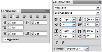
A. Working inside the Character & Paragraph palettes.
The Character and Paragraph palette options allow you to give basic text a variety of styling effects.
In the Character palette , use the following fields to�
Set the font size
Set the leading (spacing between lines of text)
Set the tracking (spacing between characters)
In the Paragraph palette , use the following fields to�
Set the text alignment
Set the text indent and spacing before & after paragraphs
Step 4: Style the Text
B. Write your text and select a font.
Select the Text Tool , click inside your document and begin typing. If different parts of the text will have separate styling, it is best to keep them in separate text layers. This label example uses three fonts: Gessele, Hana and Feliz, but feel free to choose other styles if these fonts are unavailable to you.
Select the Text Tool , click inside your document and begin typing. If different parts of the text will have separate styling, it is best to keep them in separate text layers. This label example uses three fonts: Gessele, Hana and Feliz, but feel free to choose other styles if these fonts are unavailable to you.
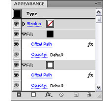
C. Style the heading.
1. Choose the "Feliz" font and make the text size 8 pt. From the Appearance palette, remove any fills and strokes from the type layer. Select Add New Fill from the dropdown menu and make it black.
Click the Effects icon and choose Path > Offset Path . Increase the value just enough to make the black text look bold.
2. Replicate the fill by clicking the Duplicate Selected Item icon . Move it below the original fill and change it to white. Click on the triangle to the left of the white fill and then click on the Offset Path link . Increase the value just enough so the white fills and outlines the black text.
3. In the Character palette, increase the Horizontal Scale to about 170%.
D.
Style the description text.
1. "soothing spray..."
Select the font Hana. Highlight the words "Soothing Spray" and change the font size to 6 pt. Change "Sore Throats" to 7 pt. Select all of the text and change the tracking to 100 to increase increase the space between characters. The text is aligned center.
In a new text layer, type the word "for" and change the font to Gessele. Set the font size to 12 pt, the tracking to 100 and the horizontal scale to 85%.
Click on Object > Transform > Shear . Enter an angle of 30 ° . Align this text in the center of the "soothing spray" text.
Select the font Gessele. Set the font size to 12 pt and the tracking to 100. Highlight the "+" with the mouse. Change the font to 7 pt Arial.
A. Draw two dotted lines.
1. With the Line Segment tool selected, click, hold down the Shift key and drag the mouse to draw a line underneath the "peppermint" text.
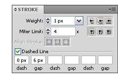
2. In the Stroke palette, set the weight to 1 px and check the Dashed Line box. Enter 0 px for the "dash" value and 6 px for the "gap" value. Make sure Round Cap is selected. This will create a dotted line.
3. With the path selected, click on the Effects icon in the Appearance palette and choose Distort & Transform > Transform . Check the Preview box. Enter 1 in the Copies field and increase the Vertical Move value until the line is above the text.
1. With the Line Segment tool selected, click, hold down the Shift key and drag the mouse to draw a line underneath the "peppermint" text.
2. In the Stroke palette, set the weight to 1 px and check the Dashed Line box. Enter 0 px for the "dash" value and 6 px for the "gap" value. Make sure Round Cap is selected. This will create a dotted line.
3. With the path selected, click on the Effects icon in the Appearance palette and choose Distort & Transform > Transform . Check the Preview box. Enter 1 in the Copies field and increase the Vertical Move value until the line is above the text.
Step 5: Finishing Touches
B. Arrange the layers.
Make sure each text layer is above the label design paths in the Layers palette. Use the Direct Selection
tool to move the text around the artboard as needed.
Text should be centered with the decoration. Turning on Smart Guides from the View menu can help you align objects relative to one another by creating temporary guides.
Text should be centered with the decoration. Turning on Smart Guides from the View menu can help you align objects relative to one another by creating temporary guides.
cut it out and apply to your container. Voila!
For a shortcut, click on the finished label image to view and print a PDF .
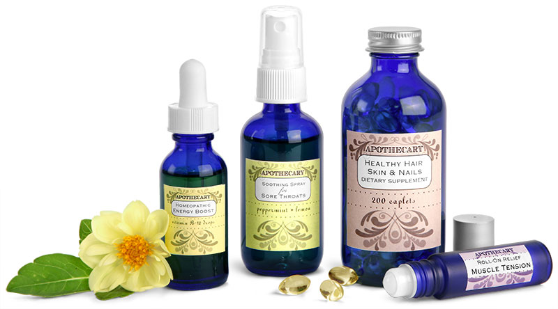
To see how this label looks on a filled container, click on the image in the box to the right. Be sure to browse through our Nutritional Supplements Index for other great label ideas!
Custom Label Ideas You May Like
 Nutritional Supplement Index Homeopathic Remedy Glass Bottles
Why Businesses Choose SKS Bottle & Packaging
SKS Bottle & Packaging makes it easy to order bottles, jars, and packaging supplies online. From fast shipping to flexible savings programs, our goal is to help businesses of all sizes source reliable packaging with a smooth and efficient ordering experience.
Chat with Us